Monday, June 22, 2009

To stock or not to stock

Well, what do you think? Is stock photography a no-no in the digital world? I am unsure!!!! I don’t have small children in my home, so childhood kits are purchased and relegated to linger in my hard drive forever….. But I do have tons of photos of nature and my cat, Sunshine. Family and friends are egar to provide me with pictures of their children but sometimes you just need that one perfect photo to make a layout pop!!!!

So what’s a scrapper to do?

I decided to take a few minutes to google stock photography. And came back with nearly 41,000,000 sites. Ok… I am not gonna go look at all of them but I did look at the major sites that were one the top.

1. IStockphoto:

Huge selection of photography available! But WOW is it expensive to buy stock photos. Subscriptions begin at $979.00 for 3 months with daily downloads at 30. You can buy individual credits minimum of 12 for $18.00 . But most photos would require 6 credits to get a decent photo…..expensive but has the stock for every occasion.

2. Shutterstock

Not as many photos as the above site, but the site is very user friendly and easy. Subscriptions begin at $249 per month with 25 downloads per day. Individual credits begin at 12 downloads for $49. Not much else to say about this one except easy to use.

3. Canstock photo

Has one million photos and by far the cheapest stock company I have found. Very good quality of photos!!!! And 300dpi photos are still only one credit WOW!!!! There are even a few free photos available. Subscriptions begin at $35.95 for one week with 10 downloads per day or one month at $99.95. Individual credits start at $18.00 for 9 photos. Sooo Best Value and easy to use by far my favorite.

I hope that you have learned something about what is avialable in the stock photo world. But as far as the decision to use or not to use????? That remains to be seen!!!!!
Sunday, June 14, 2009

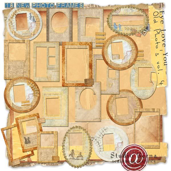
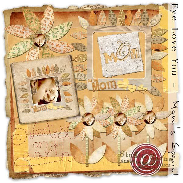
Studio Berena is have a sale!!!!! A huge sale on her eye love you products!!!! They are adorable.

So go to my Studio Berna @ SBG:

http://shop.scrapbookgraphics.com/ma...ufacturerid=28


(Oh, and by the way, you can still download the Mother's day freebie from my blog (just these few 48 hrs!!!!) that's this one (this one is really the 20th kit, but it's only temporary downloadable and totally free!):


NOTE: Please know that from Saturday morning the 13th until Saturday morning the 20th 2009 my ' Eye Love You' products will be available all for 25% off!!!!

Tuesday, June 2, 2009

Ok-so it is nearly lunch time here in the burbs of KC and I am up and ready for a Monday at work. (Not really!!!!! But dh found red bull cola and my is it tasty…)

I had a boring little lecture on the theory of triangular spacing and layout composition, but instead I decided to share with you the coolest site for playing with your landscape photos. If you read DST over the weekend you probably know what I am taking about, but if not let me introduce you to the mini maker…… TILTSHIFT

This photo site turns any photo into a miniature scale. It is so difficult to describe what it does so let me show you. But my best reference is think movie set miniatures that they make for sci-fi movies.

kcskyline

This is my home town of Kansas city. This is actually an aerial shot of the downtown metro. Now once you upload to tiltshift and they doe their magic I am given this.

kcskyline-tiltshift

A miniature scale model of my home town….how cool is that? Even better? IT’S FREE!!!!

Now the rules: The photo action really works best on landscapes and those that have some depth of field. To make the miniaturization more pronounced. Not really for those portrait shots.

Go have fun…….show me some of your home town shots miniaturized!!!!

Sunday, May 17, 2009

Inspiration in 3 parts.....coffee, chocolate and a picture

This week I wanted to look at my favorite rule from photography class that I think works really well in the digital scrapbooking. I love this rule and really need to remember to use it more often. But it is difficult to use in scrapbooking when we often don't know where a page is going to end up going. I don't always have a clear vision of the entire layout when I start scrapping.....
So let me introduce ( or remind) you to the Rule of Thirds....

The basic principle behind the rule of thirds is to imagine breaking an image down into thirds (both horizontally and vertically) so that you have 9 parts of equal distance and shape. As you’re creating a new layout, take into account the entire image you are trying to create in your mind. With this grid in mind the rule of thirds’ now identifies four important parts of the image that you should consider placing points of interest in as you create your layout. Not only this - but it also gives you four ‘lines’ that are also useful positions for elements in your layout.


The theory is that if you place points of interest in the intersections or along the lines that your layout becomes more balanced and will enable a viewer of the image to interact with it more naturally. Studies have shown that when viewing images people’s eyes usually go to one of the intersection points most naturally rather than the center. Using the rule of thirds works with this natural way of viewing an image rather than working against it.


Using the Rule of Thirds comes naturally to some photographers and for some digital scrapbookers, but for many of us takes a little time and practice for it to become second nature.
In learning how to use the rule of thirds (and then to break it) the most important questions to be asking of yourself are:


* What are the points of interest in this layout?


* Where am I intentionally directing the viewer's eye?


Once again - remember that breaking the rule can result in some striking art - so once you’ve learnt it- experiment with purposely breaking it to see what you discover.

Sunday, May 10, 2009

Color theory and something to think about.......


Color theory has long been the goal of the artist. The color wheel allows the artist to visualize the color combinations that would work well together or appear harmonious. The color wheel has been adopted as a tool for defining basic color harmony. The color wheel can suggest useful color combinations in art, but much also depends on the tastes, lifestyle and cultural norms of the artist. Color combinations are most stunning because of the contrast between warm and cool hues (in this instance meaning hues on the opposite sides of the color whee).


Some theorists and artists believe combining complementary colors to produce a strong contrast or tension, because they annihilate each other when mixed is the key to stunning art. Others believe in combining complementary colors to produce harmonious color interactions. Colors next to each other on the color wheel are called analogous colors.

A triadic color scheme, the basic adaptation used by artists, adopts any three colors approximately equidistant around the hue circle.

Use of gradations in black and white and a single color refers to the effect known as a monochromatic color scheme.

In the 20 th century color theory attempted to link colors to particular emotional or subjective associations: red is an arousing, sensual, feminine color; blue is a contemplative, serene, masculine color, and so on. This has actually not influenced the artist due to the fact that an artist's subject matter frequently dictates the color combinations presented.


OK- so much for the clinical and description information on the color wheel. (Information was compiled from Wikipedia and realcolorwheel.com) This information is just being provided to get the regular scrapper to remember that there is soooo much more to scrapping than just preserving memories. (although that is a huge part of the equation.) You are creating Art. The papers and elements created by designers follow the rules of the color wheel. Next time you look at a kit...really look at the colors chosen. Are they complementing each other or do they actually contrast. And even the selection done by you, the artist, is dictated by harmonious or contrasting color combinations. Do you love certain combinations of colors like pink/brown? (Really just gradients of contrasting Red/blue mixtures.) I am by no means says color will dictate your life, but the color combinations we do choose do express mood, emotion, and provide an additional hidden element of expression on the layout.

Hmmmmmm think about that for awhile......


Monday, June 22, 2009

To stock or not to stock

Well, what do you think? Is stock photography a no-no in the digital world? I am unsure!!!! I don’t have small children in my home, so childhood kits are purchased and relegated to linger in my hard drive forever….. But I do have tons of photos of nature and my cat, Sunshine. Family and friends are egar to provide me with pictures of their children but sometimes you just need that one perfect photo to make a layout pop!!!!

So what’s a scrapper to do?

I decided to take a few minutes to google stock photography. And came back with nearly 41,000,000 sites. Ok… I am not gonna go look at all of them but I did look at the major sites that were one the top.

1. IStockphoto:

Huge selection of photography available! But WOW is it expensive to buy stock photos. Subscriptions begin at $979.00 for 3 months with daily downloads at 30. You can buy individual credits minimum of 12 for $18.00 . But most photos would require 6 credits to get a decent photo…..expensive but has the stock for every occasion.

2. Shutterstock

Not as many photos as the above site, but the site is very user friendly and easy. Subscriptions begin at $249 per month with 25 downloads per day. Individual credits begin at 12 downloads for $49. Not much else to say about this one except easy to use.

3. Canstock photo

Has one million photos and by far the cheapest stock company I have found. Very good quality of photos!!!! And 300dpi photos are still only one credit WOW!!!! There are even a few free photos available. Subscriptions begin at $35.95 for one week with 10 downloads per day or one month at $99.95. Individual credits start at $18.00 for 9 photos. Sooo Best Value and easy to use by far my favorite.

I hope that you have learned something about what is avialable in the stock photo world. But as far as the decision to use or not to use????? That remains to be seen!!!!!

Sunday, June 14, 2009

Studio Berena is have a sale!!!!! A huge sale on her eye love you products!!!! They are adorable.

So go to my Studio Berna @ SBG:

http://shop.scrapbookgraphics.com/ma...ufacturerid=28


(Oh, and by the way, you can still download the Mother's day freebie from my blog (just these few 48 hrs!!!!) that's this one (this one is really the 20th kit, but it's only temporary downloadable and totally free!):


NOTE: Please know that from Saturday morning the 13th until Saturday morning the 20th 2009 my ' Eye Love You' products will be available all for 25% off!!!!

Tuesday, June 2, 2009

Ok-so it is nearly lunch time here in the burbs of KC and I am up and ready for a Monday at work. (Not really!!!!! But dh found red bull cola and my is it tasty…)

I had a boring little lecture on the theory of triangular spacing and layout composition, but instead I decided to share with you the coolest site for playing with your landscape photos. If you read DST over the weekend you probably know what I am taking about, but if not let me introduce you to the mini maker…… TILTSHIFT

This photo site turns any photo into a miniature scale. It is so difficult to describe what it does so let me show you. But my best reference is think movie set miniatures that they make for sci-fi movies.

kcskyline

This is my home town of Kansas city. This is actually an aerial shot of the downtown metro. Now once you upload to tiltshift and they doe their magic I am given this.

kcskyline-tiltshift

A miniature scale model of my home town….how cool is that? Even better? IT’S FREE!!!!

Now the rules: The photo action really works best on landscapes and those that have some depth of field. To make the miniaturization more pronounced. Not really for those portrait shots.

Go have fun…….show me some of your home town shots miniaturized!!!!

Sunday, May 17, 2009

Inspiration in 3 parts.....coffee, chocolate and a picture

This week I wanted to look at my favorite rule from photography class that I think works really well in the digital scrapbooking. I love this rule and really need to remember to use it more often. But it is difficult to use in scrapbooking when we often don't know where a page is going to end up going. I don't always have a clear vision of the entire layout when I start scrapping.....
So let me introduce ( or remind) you to the Rule of Thirds....

The basic principle behind the rule of thirds is to imagine breaking an image down into thirds (both horizontally and vertically) so that you have 9 parts of equal distance and shape. As you’re creating a new layout, take into account the entire image you are trying to create in your mind. With this grid in mind the rule of thirds’ now identifies four important parts of the image that you should consider placing points of interest in as you create your layout. Not only this - but it also gives you four ‘lines’ that are also useful positions for elements in your layout.


The theory is that if you place points of interest in the intersections or along the lines that your layout becomes more balanced and will enable a viewer of the image to interact with it more naturally. Studies have shown that when viewing images people’s eyes usually go to one of the intersection points most naturally rather than the center. Using the rule of thirds works with this natural way of viewing an image rather than working against it.


Using the Rule of Thirds comes naturally to some photographers and for some digital scrapbookers, but for many of us takes a little time and practice for it to become second nature.
In learning how to use the rule of thirds (and then to break it) the most important questions to be asking of yourself are:


* What are the points of interest in this layout?


* Where am I intentionally directing the viewer's eye?


Once again - remember that breaking the rule can result in some striking art - so once you’ve learnt it- experiment with purposely breaking it to see what you discover.

Sunday, May 10, 2009

Color theory and something to think about.......


Color theory has long been the goal of the artist. The color wheel allows the artist to visualize the color combinations that would work well together or appear harmonious. The color wheel has been adopted as a tool for defining basic color harmony. The color wheel can suggest useful color combinations in art, but much also depends on the tastes, lifestyle and cultural norms of the artist. Color combinations are most stunning because of the contrast between warm and cool hues (in this instance meaning hues on the opposite sides of the color whee).


Some theorists and artists believe combining complementary colors to produce a strong contrast or tension, because they annihilate each other when mixed is the key to stunning art. Others believe in combining complementary colors to produce harmonious color interactions. Colors next to each other on the color wheel are called analogous colors.

A triadic color scheme, the basic adaptation used by artists, adopts any three colors approximately equidistant around the hue circle.

Use of gradations in black and white and a single color refers to the effect known as a monochromatic color scheme.

In the 20 th century color theory attempted to link colors to particular emotional or subjective associations: red is an arousing, sensual, feminine color; blue is a contemplative, serene, masculine color, and so on. This has actually not influenced the artist due to the fact that an artist's subject matter frequently dictates the color combinations presented.


OK- so much for the clinical and description information on the color wheel. (Information was compiled from Wikipedia and realcolorwheel.com) This information is just being provided to get the regular scrapper to remember that there is soooo much more to scrapping than just preserving memories. (although that is a huge part of the equation.) You are creating Art. The papers and elements created by designers follow the rules of the color wheel. Next time you look at a kit...really look at the colors chosen. Are they complementing each other or do they actually contrast. And even the selection done by you, the artist, is dictated by harmonious or contrasting color combinations. Do you love certain combinations of colors like pink/brown? (Really just gradients of contrasting Red/blue mixtures.) I am by no means says color will dictate your life, but the color combinations we do choose do express mood, emotion, and provide an additional hidden element of expression on the layout.

Hmmmmmm think about that for awhile......